
LabXiid AI -
Enterprise workspace
for closed network

My role
UX designer (volunteer) · proof of concept covering the primary flows and interaction model
Timeline
A few months, early 2026
Scope
0-to-1 · Enterprise AI
Outcome
Live pilot · B2G
Product Overview
Labxiid AI
LabXiid AI is an enterprise AI workspace for organizations that can't use public-cloud AI — banks, hospitals, and government agencies where data has to stay inside a closed network. The founder needed design help and had none, so I joined for a few months as a volunteer UX designer. The team already had the idea and a first design. My job was to build a proof of concept: the primary flows and the backbone of the experience, so the product had a structure to build against. It is now in live pilot with NongHyup Bank (농협중앙회) and Korea University Medical Center (고대의료원), two of the most compliance-sensitive industries in Korea.
Demo
What I walked into
A design that looked finished, but wasn't built to hold up.
The first design was made with Google Studio. It looked sharp, and the key features were clear enough that I could quickly see what the team was going for. But under the surface, it wasn't ready. The screens looked like a product; they didn't yet behave like one. There were gaps everywhere — unclear flows, no rules for how the pieces fit together, and no consistent model for how a user actually moves through the product. That gap is where I came in.
What I Designed
The flows, rules, and interaction model that became the backbone.
The scope was a proof of concept: the primary flows and the backbone of the experience, not a finished specification. I designed how people find data, work inside a chat and a project, and turn an answer into something they can use. Detailed component states were left to the engineering team. The key parts:

Chat list and organization
The sidebar is ordered by how often each thing is used: chats and projects at the top, resources below them, saved items last. Chat actions — move to a project, copy link, delete — sit on the row itself rather than in a separate management screen, because finding a chat and organizing it happen in the same pass.

Enterprise data library
Search sits in the centre of the page rather than a corner, because it is the only action on this screen. Suggestions based on recent activity sit directly beneath it, so the fallback for "I don't know the exact file name" is in the same eye line as the search field.

Browsing and selecting data
Filters run across the top, the file table fills the left, and a preview panel sits on the right so a file can be checked without leaving the list. The selected count and the two destinations — add to a data collection, or add to a project — are pinned to the bottom right, so where the data goes is chosen at the end of the task rather than assumed at the start.

Adding resources to a chat
This opens as a modal over the chat rather than a separate page, so the conversation stays visible behind it. Library search is the default at the top; file upload and web links sit underneath as secondary routes, because most resources already exist in the library and only some need to be brought in from outside.

Selecting from the library
Rows expand in place to show sub-assets, so a single file can be taken from a large data set without opening another screen. The selected count and the "Add to chat" button sit together in the bottom bar, so the scope of the action is stated at the point of confirming it rather than earlier in the flow.

File upload
The drop zone takes the full width of the panel, and the accepted file types and size limits sit directly beneath it rather than behind a help link. In a closed network a rejected upload usually means a compliance rule, so the constraint is placed where it is read before the attempt.

Web links
The URL field comes first, with the rules listed directly below it: visible text only, no PDFs, and public YouTube videos imported as transcripts. They sit under the field rather than behind a help icon so they are read while pasting, not after an import has already failed.

The chat workspace
Three panes in the order the work moves: data on the left as the input, the conversation in the middle, generated content on the right as the output. The resources an answer used and its save action sit under the answer itself, so the sources are checked in the same place they are read.
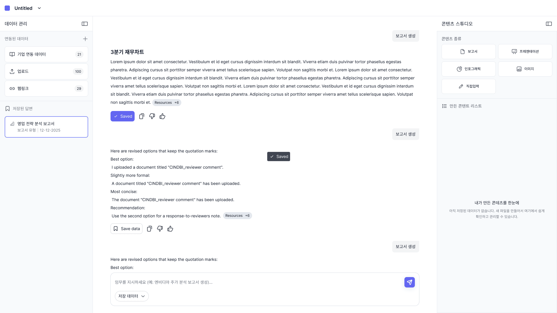
Save data
Save data marks a response as important. Everything the AI says after that builds on what you saved. And when you generate a document, Content Studio uses your saved responses first.

Generating a report
The setup panel opens on the right, in the column where the finished report will appear, rather than over the conversation. Template choice comes first, then how the data should be handled — placed directly, summarized, or passed to an agent. Both are settled before generation starts, since the clients are banks and hospitals and data handling has to be stated before the action runs.
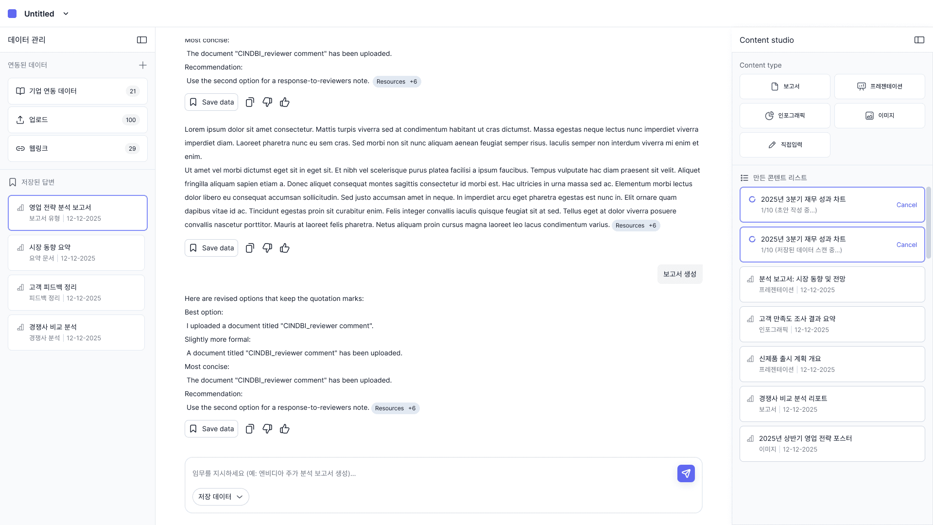
Content studio
Generated items collect in the right pane, beside the conversation that produced them, each with its type and date. Items still running keep their place in the same list with a cancel action, so in-progress and finished content are read in one column instead of two states living in different places.
Key design decision
Chat and project resources were scoped separately
Chats and projects both hold resources. The team had to decide whether they shared one set or kept separate ones. This was the main design disagreement on the product, and it determined how the rest of the resource flows worked.
What happened
The engineering team proposed that changing a resource inside a chat would automatically change it for the whole project. One source of truth, and less for the user to keep track of.
What I suggested
Keep the two apart. Changes made in a chat stay in that chat. Changing what the project holds takes a separate, deliberate action at the project level.
Why
A chat is one working session. A project is a container the same user sets up to hold resources across many chats. If chat edits propagate upward, adding a file to test something in one chat also changes every other chat in that project, and nothing in the chat shows that happening. The clients are banks and hospitals, where a change to a data set the user did not intend is a compliance problem.
Impact
Shipped to pilot in 2 months
All core flows designed and handed off part-time. Product went from no design to live enterprise pilot.
Live with regulated client
농협중앙회 — Korean banking, one of the most compliance-sensitive industries.
Scoping architecture established
Chat-level and project-level actions deliberately separated — protecting users from invisible side effects in sensitive data environments.
Full product scope
Navigation, search, content generation, data management, and resource flows — all designed and shipped solo.
Key insight
Designing alone, on a team that was building at the same time
I was the only designer on the product, and engineering was building while I was still designing. Work I handed over usually appeared in the product within days, which meant the responsibility for getting it right sat with me.
It was also my first time working in Korean. Sharing a concept was generally enough for the team to build from, so I did not need to specify hover, focus, and other component states. That let me spend the time on structure and flow instead of detailing every state.
The most difficult part was explaining my reasoning when I pushed back on something the team had already decided, such as the resource scoping. Those discussions resolved without problems.